The 6 most popular R packages for Dataviz
The tiny fraction of R libs you can't miss out!
👋 Hi!
Those days I’m diving deep into the world of R and Python for data visualization as I am improving the graph galleries.
While both languages are incredibly robust, one thing stands out IMO:
R has a treasure trove of packages specifically designed for dataviz, whereas Python mostly leans on matplotlib tweaks.
🌊 A Sea of Choices
As of now, CRAN boasts a whopping 19,805 packages.
That's a lot to sift through!
Even as someone who spends hours exploring R for projects like the R Graph Gallery and data-to-viz.com, I've only scratched the surface.
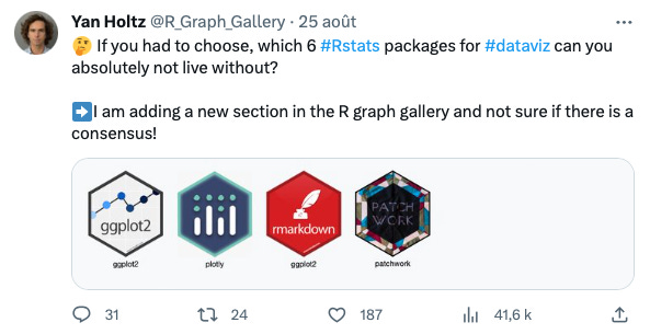
So, I took to Twitter to ask: what are your go-to R packages for data visualization? 🤔
I received 31 responses, which, granted, is a tiny sample of the R community.
So this is not real science of course but I think I am right pointing the following as the most popular R packages for dataviz:
1️⃣ ggplot2 & the tidyverse
🔗 github: link | ⭐️ stars: 6.1k | ✍️ author: Hadley Wickham et al.
Not surprisingly, these were the top picks. It is now the gold standard for data analysis in R.
ggplot2 is all about creating stunning and complex plots with ease, while tidyverse is a collection of R packages designed for data science.
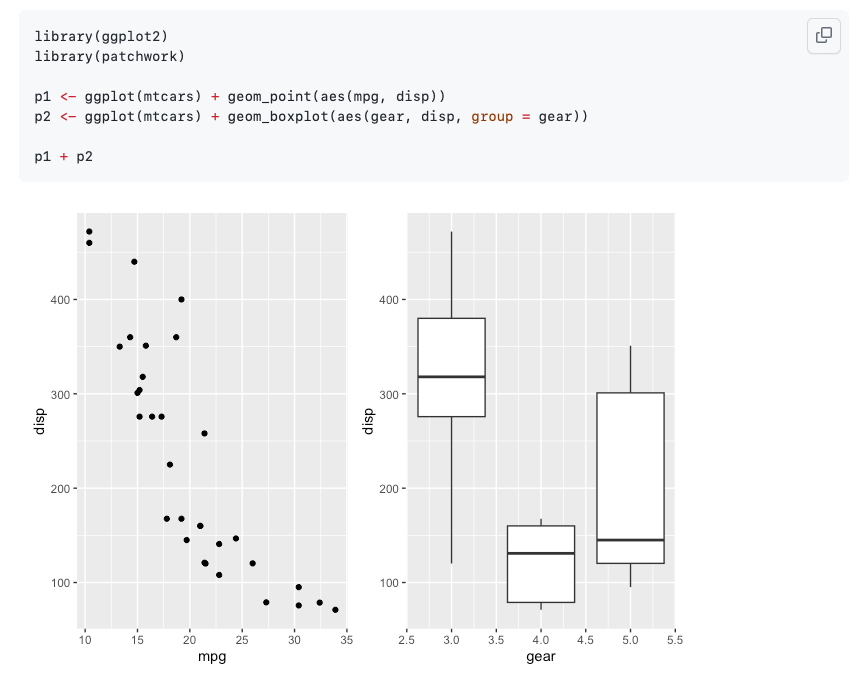
This is how building a scatterplot looks like in ggplot2:
Resulting in the following figure. Neat, isn’t it?
2️⃣ patchwork
🔗 github: link | ⭐️ stars: 2.3k | ✍️ author: thomasp85
This package lets you combine multiple ggplot2 plots into one visual masterpiece.
It is a game-changer for anyone who's struggled with the often cumbersome task of combining plots.
It's no wonder it gained rapid adoption—it solves a very specific but widely-experienced pain point, making it easier than ever to create composite visuals.
3️⃣ Ggiraph, 4️⃣ Plotly, and 5️⃣ Shiny
🔗 github: link | ⭐️ stars: 701 | ✍️ author: David Gohel
🔗 github: link | ⭐️ stars: 2.4k | ✍️ author: Plotly
🔗 github: link | ⭐️ stars: 5.1k | ✍️ author: RStudio
These packages are leading the charge in the growing trend of interactive data visualization within the R community.
ggiraph adds interactivity to ggplot2 graphics, allowing users to hover over or click on elements for more information.
Plotly is another library that can create interactive plots with minimal code, and it integrates seamlessly with R. (I’m in love with the ggplotly() function btw ❤️)
Shiny takes it a step further by enabling the creation of interactive web apps for data visualization and analysis.
Together, these packages underscore the increasing importance and ease of building interactive data experiences in R.
If you curious, try the following code to see the magick!
6️⃣ ggtext
🔗 github: link | ⭐️ stars: 614 | ✍️ author: wilkelab
This one popped up 5 times and I did not even know it! 😳
ggtext provides simple Markdown and HTML rendering for ggplot2. It makes it much easier to add some proper annotations:
But there are so many more 📈!
If you're new to R, these 6 packages are a great starting point.
For the seasoned R users among us, this result is not earth-shattering though.
But the tweet responses also led me to some hidden gems 🔥. I learnt about things like rayshader, ggbeeswarm, ggpubr and so many others.


Curated list coming 🙇♂️
To help you (and me!) navigate this landscape, I've started a curated list on the R Graph Gallery.
This list is growing and changing as I am speaking. Packages will be added progressively based on three criteria: GitHub stars, download number, and my personal taste 🙃.
But more importantly, I would love to hear if you have a favorite R package that you think deserves a spot on the list! ❤️🙏
Thanks and have a wonderful week!
Yan
Note: In the JavaScript world, we have the State of JS , an annual survey of the JavaScript ecosystem. Should we start a State of R at some point? 🤔


Thanks for this Yan!