Stunning charts with Python
Pushing matplotlib to its best 🔥
👋 Hey!
Today I’m back at work, and very glad to announce a new section in the Python Graph Gallery! 🎉
R or Python for dataviz?
In the world of data science, 2 main programming languages dominate: R and Python.
They both have pros and cons. But when it comes to Data Visualization, I’ve always been surprised to see how many stunning charts are produced by the R community compared to Python 🤔.
I have no idea why it is the case (and if it is even true). But I spend a lot of time browsing the internet in the quest of great charts and that’s how I feel it.
R is powerful. So is Python.
R is very powerful for dataviz, notably thanks to the ggplot2 package and its extensions.
But Python is pretty awesome too!
Matplotlib is a pretty solid library. It allows to build any kind of chart type with all the customisation you could dream of. Plotly has a Python library too, allowing to create powerful interactive charts.
A list of stunning Python charts
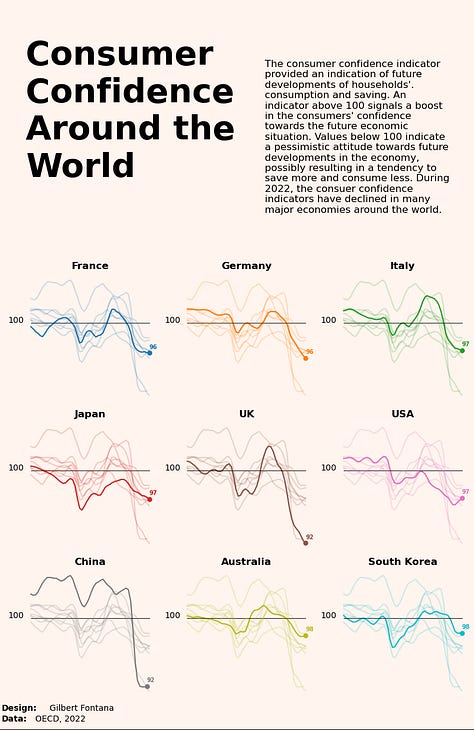
To face this lack of stunning python charts, I created and translated some of my favorite graphics to Python 🙇♂️.
It results in a list of 22 insightful & beautiful charts, coming with their reproducible code and some explanation about it.


I hope this can be useful to level-up your dataviz skills!
If you know someone who creates some ugly charts with Python, please share this content with them 😋.
If there is some good python viz content I should add, please let me know 🙏
That’s it for today!
Yan
PS: thanks a lot to the original authors of the charts, and to the people who helped me for the translation. They are always cited in the posts. 🙏🙏🙏

