👋 Hey!
Over the past 10 years, I've worked as a data analyst and software engineer in both academic and industry settings.
Alongside my professional work, I've created and maintained eight websites focused on data visualization 🎉. These sites are free, open-source, and educational.
Interestingly, I've never presented them all together—so that's exactly what I plan to do now, hoping that one or several of them will be useful to you 💙!
🥁 Let's get started!
1️⃣ The R graph gallery
Everything started with the R graph gallery: A collection of hundreds of graphs made with R, always coming with explanation and code.
The website showcases more than 400 graph examples, most of the time made with ggplot2 and the tidyverse.
The project covers both static and interactive graphs. There are many contributors and it is now visited more than 800k times per month 😀!

2️⃣ The Python Graph Gallery
Pretty much the same thing, but for Python! 🐍
Since the R graph gallery was getting some traction, I decided to export the concept. The website mainly targets matplotlib, but seaborn, plotly and pandas are also very present.
On top of more than 200 beginner-friendly tutorials, I am proud of the best python charts section.
It provides more than 20 examples of extremely polished charts, pushing the limits of matplotlib.
3️⃣ From Data to Viz
Over time, my work increasingly centered on Data Visualization. Colleagues began to seek my advice on the most effective chart types for displaying their results.
This led me to create data-to-viz.com.
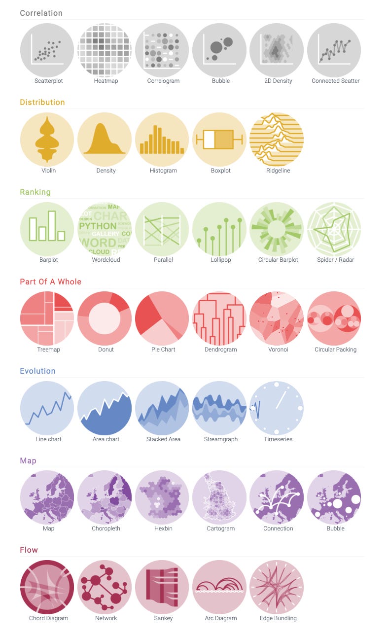
Data To Viz serves as a comprehensive guide to chart types, organized by the format of the data you have. It functions as a decision tree, packed with actionable insights. Simply input the characteristics of your dataset, and the platform will guide you to suitable graph types, complete with recommendations and warnings to consider.
There is even a poster coming with it, showing the full decision tree:

4️⃣ Dataviz caveats
To create a great chart, you probably want to start by avoiding the most common mistakes.
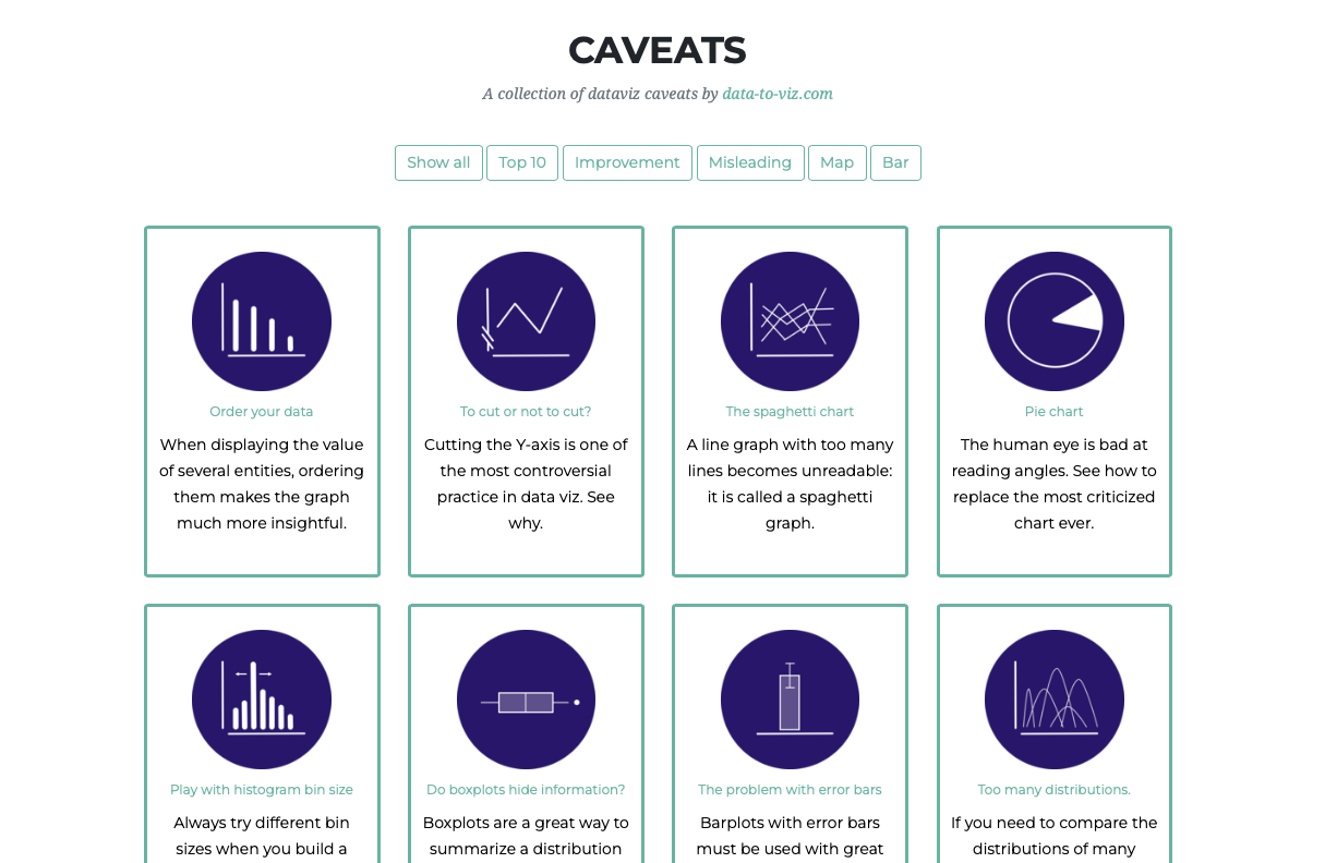
So I added a section called dataviz caveats to the data-to-viz project. It is a collection of the most common caveats in dataviz, like making a 3d pie chart, hiding information in a boxplot, building a spaghetti chart and more.
5️⃣ Pimp my RMD
I am a very big fan of R Markdown. (And Jupyter and Quarto that are kind of equivalent).
If you are analysing data and those names do not ring the bell, you should stop what you are doing and explore.
It basically allows to put text, images, code, and results in the same report, making your data workflow thousand times more efficient.
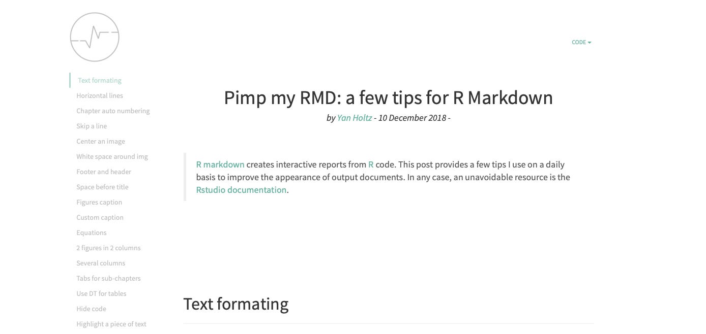
Pimp my RMD is a document that provides 30 tips and tricks to customise your R markdown report. It even comes with a template I created called epurate (that probably needs to be updated 🙈)
6️⃣ - 7️⃣ The D3 and React graph galleries
Four years ago I became a web developer, and started to work for the dataviz team at an awesome company called Datadog. 🎉
I stumbled upon a game-changer: JavaScript.
This programming language unlocked a myriad of possibilities for data visualization, thanks to the introduction of interactivity.
Among the tools available, D3.js stands out as the premier JavaScript library for data visualization, while React is the go-to library for crafting user interfaces.
To help others navigate these powerful tools, I've developed two additional graph galleries that provide step-by-step guides on creating charts using D3.js and React.
8️⃣ Dataviz inspiration
Dataviz-inspiration.com is the last piece in my puzzle!
While my other websites guide you on which charts to create and how to construct them, I recognize that starting a new project often comes with the daunting challenge of a blank canvas.
To help you overcome this hurdle, I've launched what I like to call the "Pinterest of Data Visualization."
This platform features a curated selection of around 200 data visualization projects that I admire, all filterable by chart type.
It's designed to inspire and assist you in your upcoming projects. 🔥
🤔 What’s next?
I am currently in a sabbatical, which means I am working hard on those projects. I also have a couple of other project ideas but that will be revealed later 🤫.
If there is anything coming to your mind to improve my websites, please let me know!
I hope those project helped you or will help you soon. And I can’t finish this post without thanking all the people who helped me in my journey.
🙏🙏🙏🙏🙏🙏🙏
Cheers!
Yan


